I was the sole product designer on Quick-React — a feature that surfaced a persistent, contextual reaction entry point on Messenger, shipped to over a billion monthly active users.
Impact
My Contribution
01 —The Problem
Reactions were underused — not unwanted
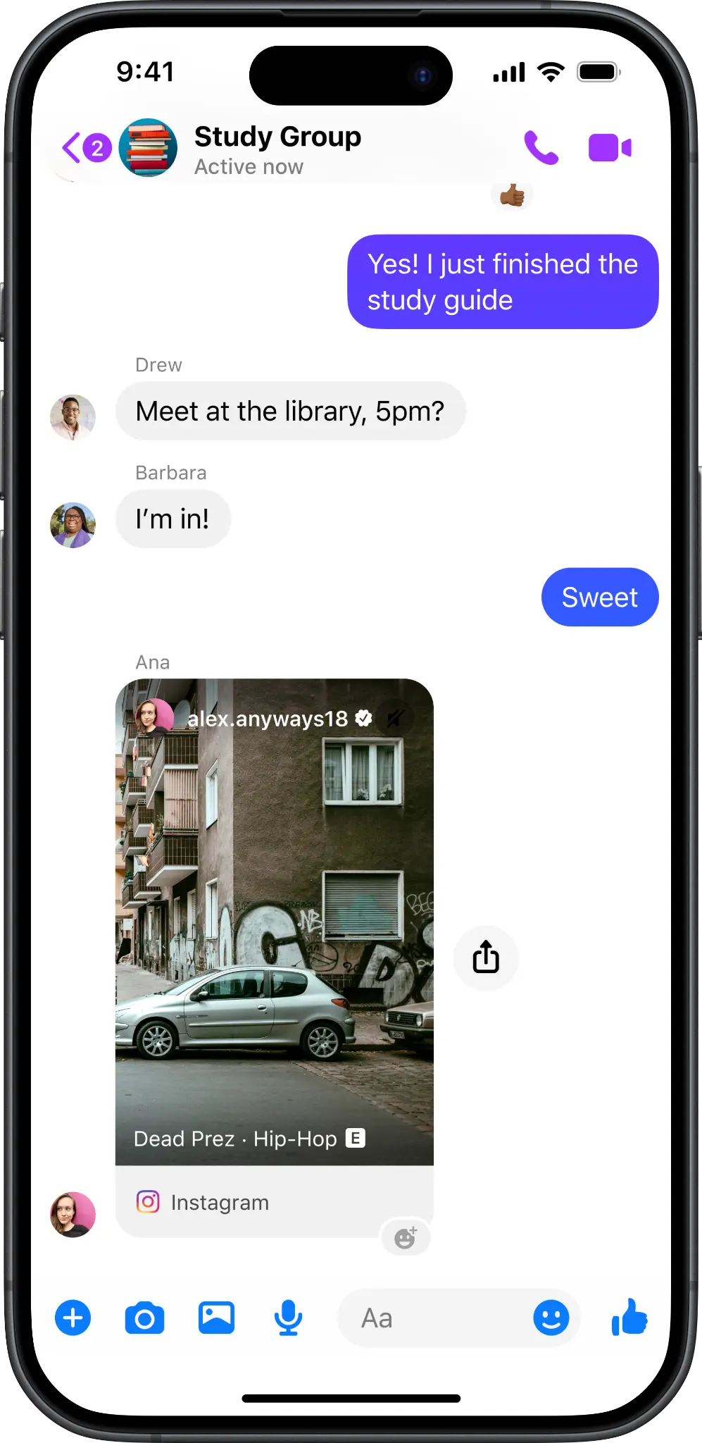
People need a lightweight, quick way to respond to messages — but even reactions, the simplest form of reply, were being underused. The entry point required long-pressing a message, an industry-standard gesture that many users either didn't know about or didn't reach for instinctively.
It wasn't that people didn't want to react. It was that they didn't see the door.
Internal signals showed reaction usage was significantly lower than on comparable platforms — a clear awareness gap, not a motivation gap.

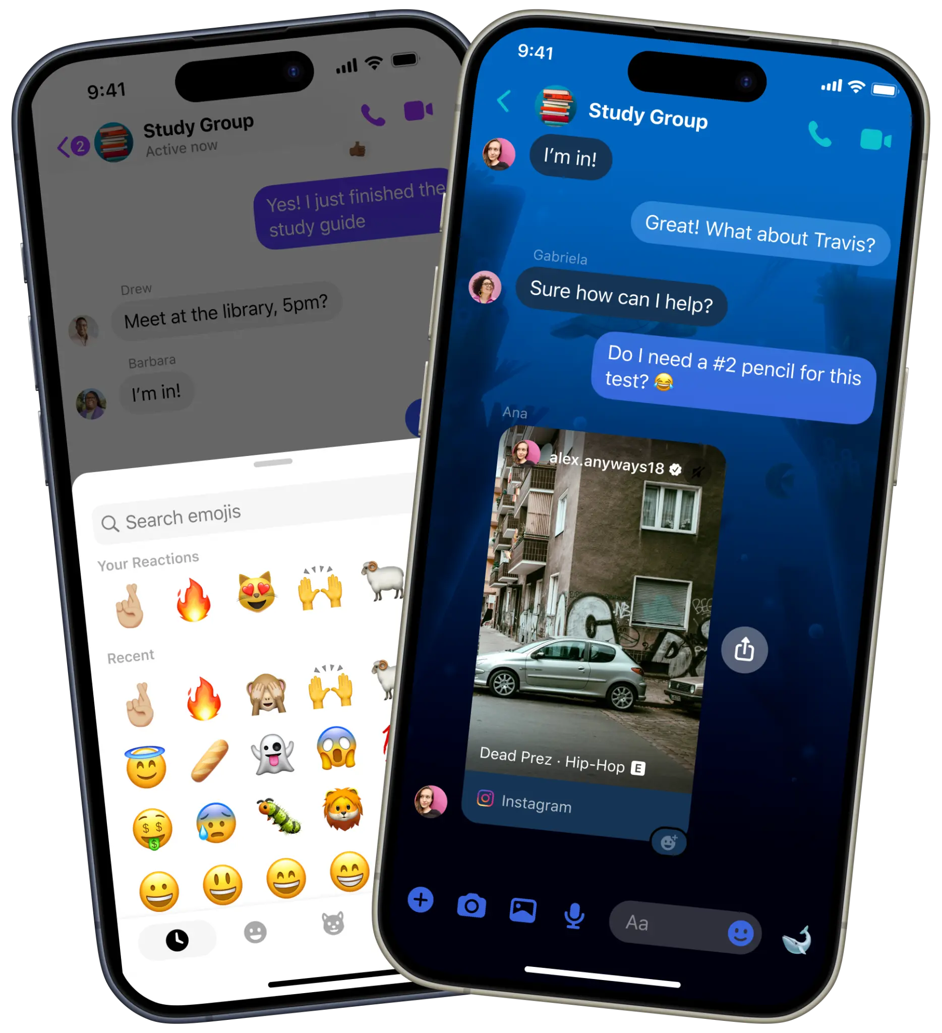
The Quick-React tray — six default reactions plus a customizable slot
The hypothesis
"Increasing awareness of reactions — by surfacing a persistent, contextual entry point near the most recent message — will lead to more frequent use without disrupting conversation flow."
02 —Constraints & Considerations
This wasn't a blank canvas
Before exploring solutions, I mapped the guardrails. Each constraint shaped the design space before a single pixel was drawn.
No visual clutter
Messenger's chat UI is information-dense. Any new element had to earn its space.
Contextual relevance
The entry point only makes sense near the most recent message — not surfaced everywhere.
Parity across content types
The solution needed to work coherently across text messages, images, and reels — each with different visual compositions.
No emoji suggestions
Surfacing the wrong reaction could feel worse than no suggestion at all — an inappropriate emoji in a sensitive conversation is a real risk.
03 —Key Design Decisions
Three decisions that defined the feature
Entry point: visible, not suggested
The core tension was between making reactions more visible versus suggesting specific emojis. I explored both. Emoji suggestions lower effort further — but the risk of an inaccurate or contextually inappropriate suggestion outweighed the convenience. A reaction should feel like the user's choice, not the app's guess.
I landed on a persistent but minimal entry point anchored to the most recent message — visible without requiring any gesture, unobtrusive enough not to compete with the conversation.
Early dogfooding with the design team confirmed the entry point increased reaction visibility without feeling intrusive.
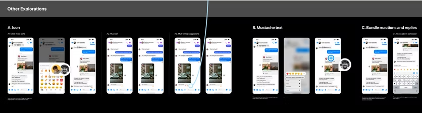
Other explorations considered — icon variants, mustache text, and bundled reactions
Three variants, one interaction pattern
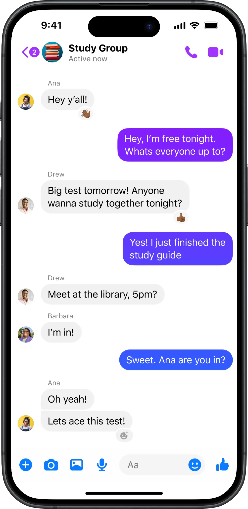
The entry point had to work across three distinct message types, each with different visual logic. I designed a layout-appropriate variant for each: a text entry point anchored adjacent to the message, an image entry point positioned to avoid obscuring the media, and a reel variant adapted for video content within chat.
Using one consistent interaction pattern across all three kept the experience coherent — users don't need to learn different gestures depending on what they sent.
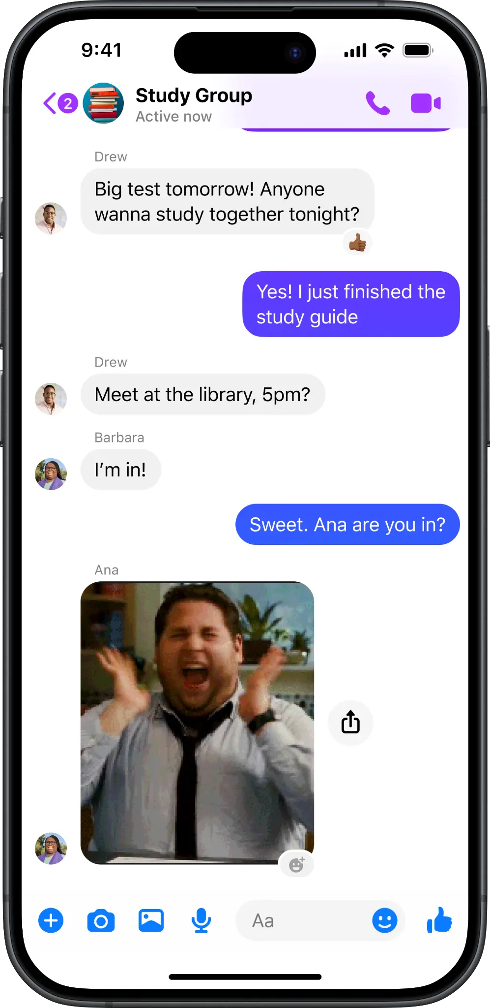
Text
Image
Reel
Left to right: text, image, and reel entry point variants
Collaborating under time pressure
This project had a fast turnaround with direct involvement from Messenger Leadership. What kept it on track wasn't rushing the design — it was ruthless prioritization and transparent communication. I ran dogfooding sessions with the engineering team to validate that designs were true to spec before handoff.
04 —Outcome
What shipped
Quick-React — reaction entry point on the most recent message
The feature shipped to Messenger globally, surfacing a persistent reaction entry point on the most recent message across text, image, and reel content types.
Shipped to Messenger's global user base of over 1 billion monthly active users. (MAU figure is publicly documented in Meta's earnings reports.)
05 —Reflections
What I learned
This project sharpened my instinct for restraint. The temptation was to do more — add emoji suggestions, animate the entry point, personalize the reaction tray. The right call was simpler: remove the friction of finding reactions, then trust users to take it from there.
It also reinforced that speed and quality aren't opposites. A tight deadline doesn't mean skipping the design process — it means being clearer about what matters most and protecting that, while cutting everything else.